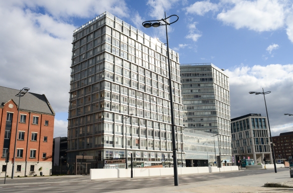
In terms of the Degree Show deadline getting closer, I have seriously begun to think about how best to display them. Because my images are of architectural structures I want to print them fairly large, in order for them to be impactful to the audience. I shot on Raw quality as I knew this would enable me to print quite large, as the file size can handle being printed at a large size. I decided to print 12 x 18 which is a touch bigger than A3, the size is something that I have had to consider in terms of its relation to practical modes of presentation.
I put in my proposal and currently I am happy with my provisional space for for my photography exhibition part of the degree show. I have had multiple discussions with tutors regarding the best way to display my work. Mounting, finishing and positioning of each image was discussed. I have decided to mount my images at C41 in Ellesmere Port, my final selection of images will be mounted on 5mm Foamex board which is a strong plastic. This will ensure that my images will be flat, and therefore look professional when attached to the wall.
I was originally going to display my images in a grid like formation, but after a couple of tutorials and experimentation with some test prints I have decided to position my images in a horizontal line. Positioning them this will encourage the viewer to walk along and experience and appreciate each individual image, rather than just glancing at them as a whole collection of architectural images. However I have conducted some brief research into potential ways to present my images below.
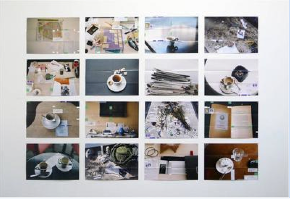
Grid Formation
+ Work is seen as a collection, all interlinked.
+ Looks professional, modular and quite rigid
– Can look quite formal and boring
-Individual images are overlooked, as the presentation usually suggests more of a gestalt rather than individual photographs
Line Formation
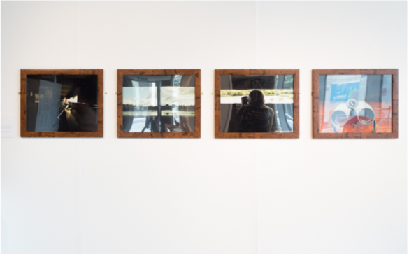
+ Encourages viewer to appreciate every image, one leads on to the next etc
+Connotes the idea of a journey, line encourages movement. Would fit well with my type of imagery
– Takes up more space, need to be sure this will fit in proposed space
-Images need to be the same size, would it work as well without framing images
Chaotic but also Ordered Arrangement of Images
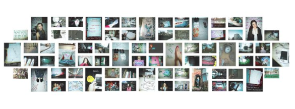
+Looks unusual and therefore can be quite intriguing
+Work all fits nice together, the negative space in-between would draw audience into the images and encourage them to look closer
-Looks quite chaotic but also ordered
-Would require a lot more images than your final selection
-Would require a lot of space, would also be bold and quite distracting for other work that is surrounding yours in the exhibiton
I have considered all of the positives and negatives in terms of modes of presentation, and thought carefully about which would be most successful to use to present my architectural images. I feel that displaying them in a horizontal line would be most successful, as this would create a sense of movement and the images would interplay and connect with each other. I still need to finalise the order of my images, but this will be something I experiment with now that I have decided to display my images this way.